Superman returns with unwavering resolve, his eyes set on a brighter tomorrow.
My Rating: ⭐½ (1.5/5 stars)
Let's start with the positives. I appreciated the fresh faces portraying Superman, Lois Lane, Lex Luthor, and Jimmy Olsen, particularly in the later scenes and action sequences. The special effects were impressive, and the soundtrack was a highlight. However, that's where the praise ends.
Unfortunately, this film might be the weakest Superman installment to date. Despite a promising cast, the storyline fell short. The inclusion of the Justice League characters like Green Lantern, Mr. Terrific, and Hawkgirl felt forced and detracted from the narrative. It was supposed to be a Superman movie, not a mixed ensemble. Although I'm a bigger fan of Green Lantern than Superman, his role in this film felt misplaced. Nathan Fillion, a fantastic actor known for his sci-fi roles and being a real-life nerd, was miscast. Overall, this movie did not make it to my list of favorite Superman films.
A more compelling story line and perhaps sticking with Henry Cavill as Superman could have improved the film. While the new actor wasn't terrible, and might have been acceptable had Cavill not already owned the role, he couldn't save the film.
This product uses the TMDb API but is not endorsed or certified by TMDb.
I was reading my RSS reader BazQux the other day and came across a post by rscottjones about retirement planning. With approximately 8 years until my own retirement, I've started planning too. I found his approach very interesting.
I like reading what other people are thinking and comparing ideas. Since he shared his and his wife's general plans, I thought I'd share mine to help organize my own thinking.
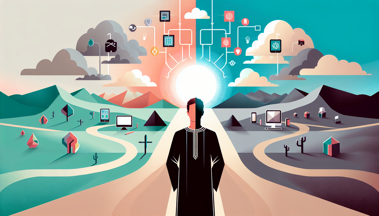
A visionary stands at the crossroads of innovation, contemplating the expansive network that may redefine the future of technology.
I have been a loyal Microsoft Windows customer since I've owned a PC and MS-DOS was a thing. I went to the events they had for major OS releases with my Dad. We both went to see the exciting things that happened when they used to stream them at movie theaters. I was there for the launch of Windows 95.
But it is my opinion that Microsoft has totally lost its way with regards to the consumer and Windows.
Yes, this is a rant, and I believe it may be too late for Microsoft and Windows with consumers. I know I am not a very techie person, but I believe that Windows is getting too messy in a lot of areas like advertisements everywhere, sloppy code, updates that seem like beta versions, telemetry, privacy concerns, and just all around not caring.
Episodes: 6 | Aired: September 2025 – October 2025
Season Overview
I've just finished watching Season 5 of Slow Horses on Apple TV, with Gary Oldman delivering another stellar performance. The season was fairly average, not particularly memorable but not disappointing either. It would be intriguing to see a season focused on a younger Lamb and his fall to Slough House, providing a fresh narrative arc. My typical concerns with streaming series persist here: the six-episode format felt too brief, resembling a mini-series more than a traditional season. Moreover, the wait for the next installment could be lengthy, based on previous patterns.
This product uses the TMDb API but is not endorsed or certified by TMDb.
Season: 3 | Aired: July 11, 2025 – September 12, 2025
Episodes: 1–10
Service/Network: Apple TV+
Season Overview
This season took the top spot, closely followed by the first. The second season didn't quite hit the mark. The plot twists this season were captivating, and I'm looking forward to what comes next. The characters this season displayed more complexity and depth. It was also fascinating to see the series weave in a secular version of a trinity concept to portray the governance of an empire, a bold move considering the author's reputed atheism.
Best Episodes
The best episode was undoubtedly the season finale, though the preceding three or four episodes were also quite strong.
This product uses the TMDb API but is not endorsed or certified by TMDb.
After snagging a free month of Apple TV, I managed to binge-watch the second season of Silo. It was excellent. I'm really looking forward to Season 3 and hope they explore more of the backstory.
Best Episodes
The season finale stood out as the best episode. The whole season was truly remarkable.
– Episode 10: Into the Fire
This product uses the TMDb API but is not endorsed or certified by TMDb.
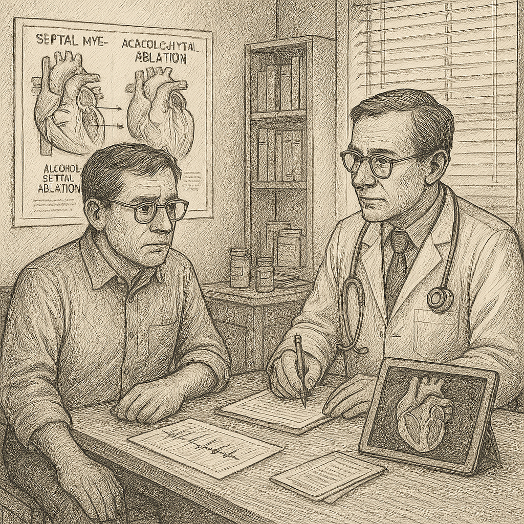
A serious medical discussion about heart treatment options between a patient and his cardiologist.
This has taken me so long to post because I am still trying to process a lot of stuff and weighing a lot of pros and cons. I went to my HCM Cardiologist (Hypertrophic Cardiomyopathy Specialist) recently. I had an ECHO first then saw him. It was not good news from the ECHO. Even though I feel no symptoms with the Camzyos, I will need to take drastic measures in the future, though the timeline wasn't really given. But my gradients are not improving. Last time my gradient at Valsalva was significantly elevated with 100% obstruction. This time it was still elevated and still 100% obstruction at Valsalva.
An engineer lost in thought, surrounded by a maze of circuits and the glow of futuristic interfaces.
Lately, I’ve been swamped with projects and short on energy to tackle them, partly because of my worsening eyesight. I have glaucoma, but thankfully no loss of vision. My treatment includes twice-yearly eye pressure checks and nightly latanoprost. Even so, my glasses prescription seems to need constant updates, and I’ve always had a lot of floaters. My ophthalmologist reassures me that the floaters and eye pressure are fine, but my vision keeps changing, which is frustrating. After a recent visit to an optometrist for new glasses (an immediate improvement at first), I quickly found myself struggling again. It’s baffling how fast my eyesight shifts.
This ongoing vision issue is a big reason I’m putting off other projects. Other medical concerns, like my heart health, are actually improving. I have two SunFounder Pis to build, a few minor tasks, and I’m refining my blog and social-event posting software. I expect these projects to be fully functional soon, and I’ll update my blog as they progress.
Despite having plenty to work on, my motivation is flagging.
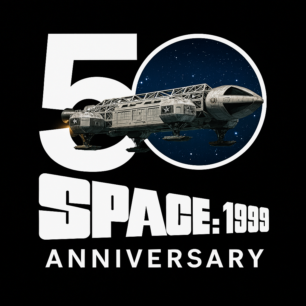
I don't typically blog about every anniversary or special date. However, I have a soft spot for “this day in history” and similar themes. Yet, some memories from my youth, like Space: 1999, truly resonate with me. Watching it on Saturday afternoons or evenings, I always thought it was an incredible show. I even bought the 30-year complete edition on DVD.